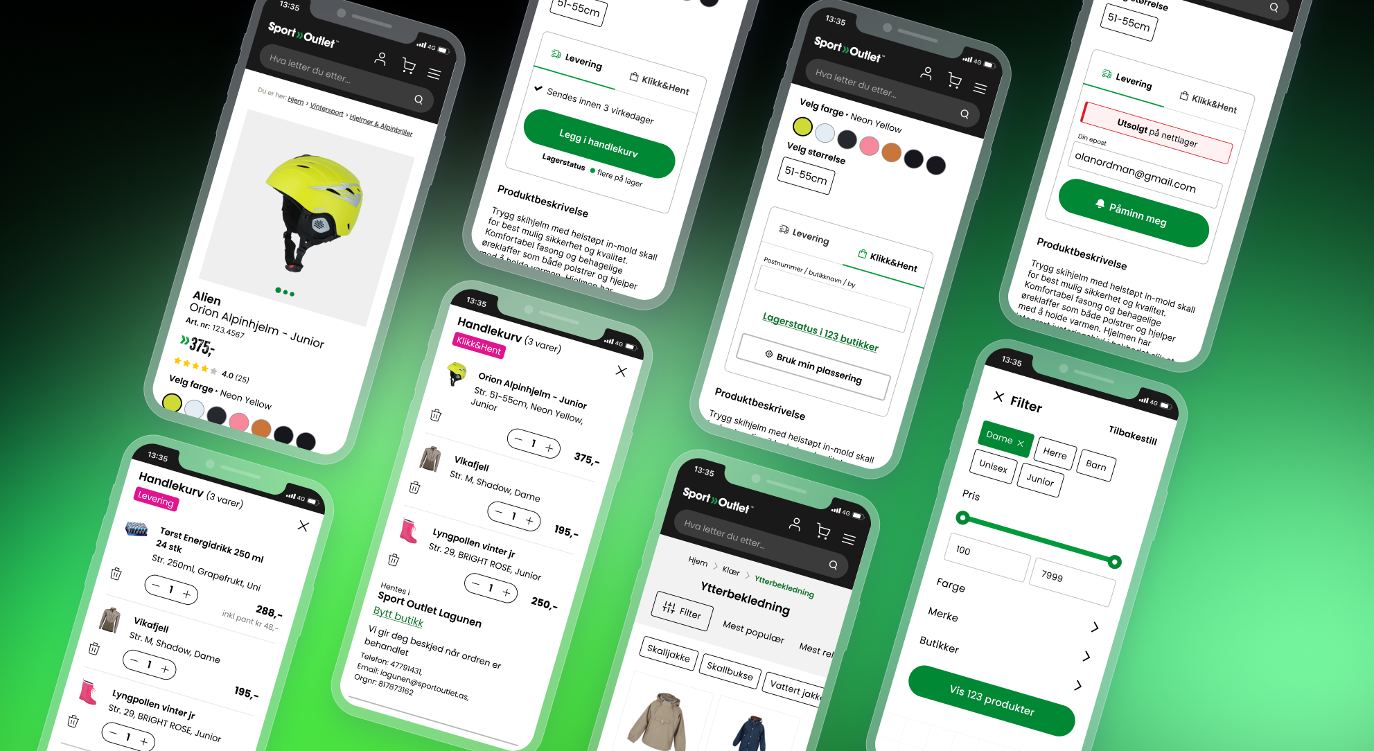
Sport Outlet’s e-commerce platform required improvements in several key areas of the shopping experience. The company had recently introduced online shipping, while previously the store only offered in-store pickup (Click & Collect). This created new complexity in the purchasing flow, especially on the product page where users had to clearly understand whether they were ordering for delivery or pickup.
At the same time, several areas of the store showed usability issues, including product filtering and inconsistencies in UI components across the platform.
The goal was to improve clarity in the purchase flow, reduce cognitive load for users, and ensure a more consistent interface across the store.
I worked on improving specific user flows and interface sections across the e-commerce platform.
My responsibilities included:
User observations and internal usability testing revealed several usability challenges.
Some navigation elements were ambiguous, which created confusion when users tried to continue the purchasing process. The introduction of shipping created additional complexity because availability rules differed between delivery orders and in-store pickup.
For example, when selecting Click & Collect, all products in the cart needed to be available in the selected store. This requirement was not clearly communicated in the original interface.
Another challenge was product availability. Some items were only available in physical stores, especially discounted products. The interface needed to communicate these constraints early to avoid frustration during checkout.
Filtering was also identified as a weak point in the browsing experience. Filters were inconsistent, not always relevant to product categories, and sometimes difficult to use.
The product page was redesigned to clearly separate shipping and Click & Collect options using a tab-based interface.
Additional improvements included:
These changes helped users understand purchasing options earlier in the journey and reduced confusion during checkout.
The filtering system was redesigned to support faster product discovery.
Improvements included:
The new filtering experience was inspired by best practices highlighted by sources such as Baymard Institute and Nielsen Norman Group.
While working on these improvements, I also contributed to the gradual expansion of the design system and component library. New components were added based on needs identified during UX iterations.
This helped:
The improved purchasing flow contributed to a 250% increase in revenue, supporting the transition from store-only sales to a combined online and in-store commerce model.

