Partech, an industrial e-commerce store, wanted to increase visibility of a newly produced company video presenting their team and expertise. The client initially suggested placing the video on the homepage and in the “About us” section.
At the same time, they mentioned another issue: a strategically important section called “Parker Store” located in the hero area was receiving very little attention from users.
To better understand the problem, I conducted a short UX audit of the homepage hero area and main navigation.
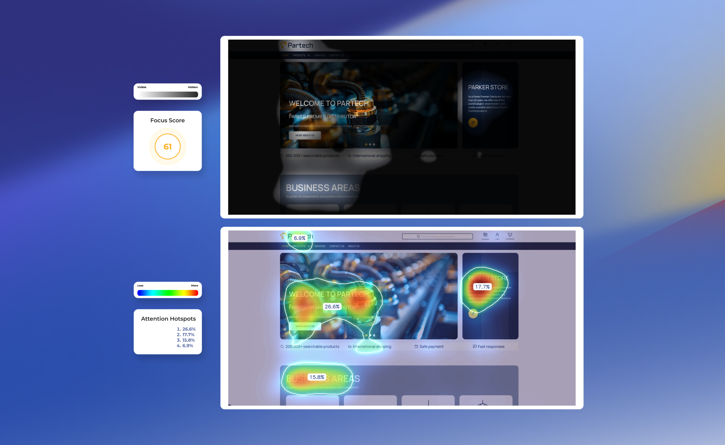
Google Analytics indicated generally low engagement on the homepage. Most users bypassed the content and used the search field directly.
I independently conducted a UX audit and proposed a redesigned hero section.
My work included:
The audit revealed several issues affecting user attention and hierarchy:
Heatmap analysis also showed that users’ attention focused mainly on the large background image instead of actionable elements.
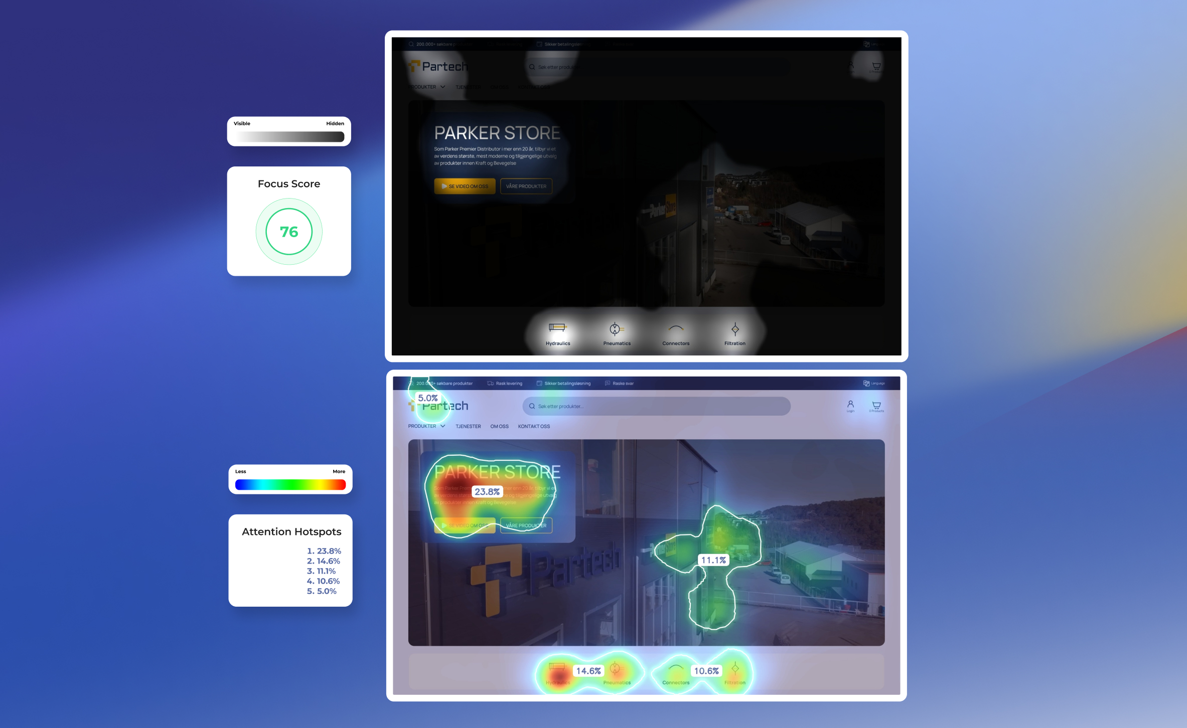
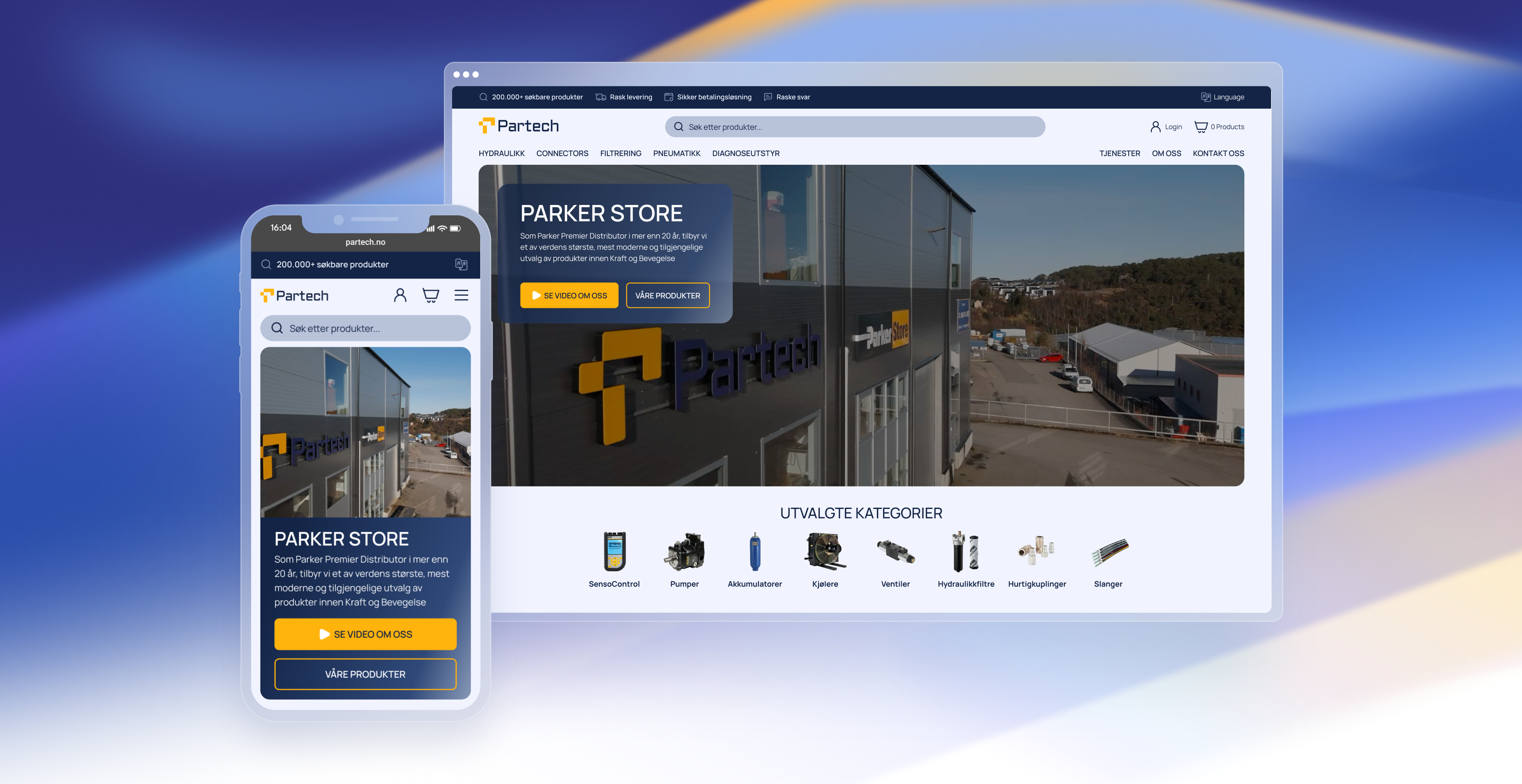
The redesigned hero section improved the visual hierarchy and guided user attention toward key elements.
Key improvements included:
A second attention heatmap test showed a higher focus score and clearer attention distribution, indicating a stronger visual hierarchy and better alignment between user attention and business priorities.